Producing the Perfect Print: A Guide for Photographers
Producing a decent print is not as easy as you might think. You might get lucky and get a great result the first time. But, more likely, when you start printing your work, you’ll find it might not look as good as you’d hoped. Don’t give up. With a bit of practice and a better understanding of the process, you can quickly improve your printing.
Printing Can Be Difficult
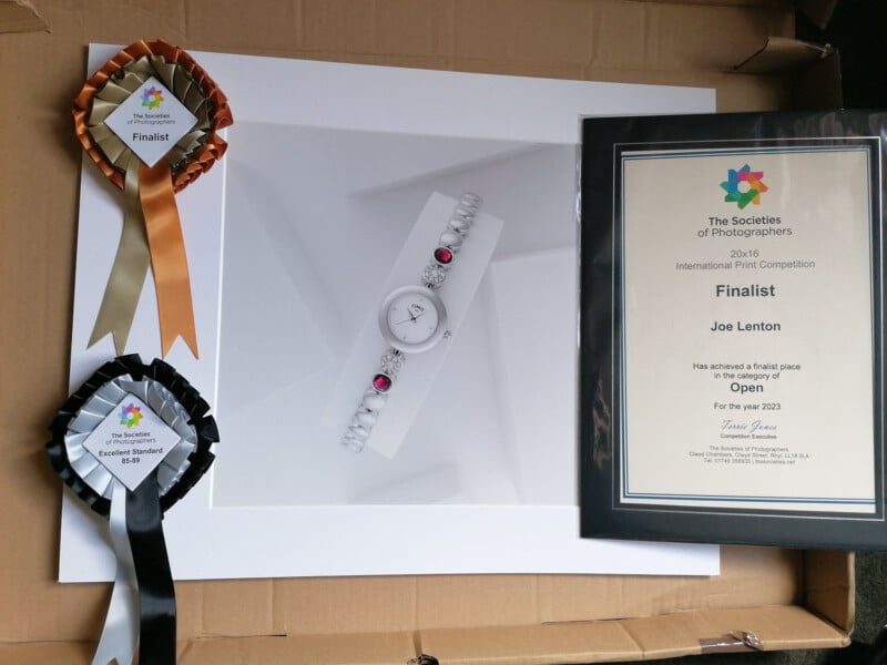
Most of the time, I don’t print my work. So, I had to learn a lot about printing in order to pass my Fellowship assessment. As a product photographer, my job usually ends with delivering image files to clients. When I did my Fellowship with The Society of International Commercial & Industrial Photographers I had to submit a panel of 20 prints. This meant that I had to learn how to get the right results on paper and not just on screen. In this article, I’d like to share with you some of what I learned in the hope that it will help you to improve your prints too.
The Peculiarities of Print
One of the first things to get your head around that makes printed images different from those on screen is the fact that prints reflect light, whereas your monitor emits light. On one level this is pretty obvious. But it can mean that what looks good on a screen might not look so good on paper.
Most of us when we start out will be surprised at how dark our first prints look. Unless you are using a print lab that re-processes the image file for you, the chances are that you’ll assume your print will look the same as it does on your monitor, and you’ll end up with a darker image than you wanted. Screens tend to have some kind of backlight that can make everything including blacks look brighter. So, there is a danger that if you have very subtle details in very dark areas, they could get lost in translation when printing. This is partly because it is being lit – indeed it is emitting light from the screen. It is also because different screens and papers have different black points (we will look at this in more detail later).
Our perception of color and brightness changes relative to what is around us. We don’t all see everything in the same way. Degrees of color perception can vary by the individual. We can get used to seeing our images in one set of viewing conditions and get caught out when those conditions change. The light from a good-quality, calibrated monitor will be pretty consistent. We need an external light source to view prints and that can vary considerably. Light of varying intensity and color temperature can have a pronounced effect on what we see. So, don’t expect an exact correlation between your prints and what you see on screen.
Do It Yourself?
If you are going to print images regularly and you find yourself using the same paper types over and again then you may well be better off printing at home. Personally, I print so rarely and don’t always use the same paper, so it is far more cost-effective for me to use a print laboratory service. It can take a bit of testing to find one that you trust to do a great job.
Some labs automatically alter image files before printing. I would suggest that you learn the process and keep control of the file yourself if possible. They should offer you the option of not processing your files. This helps you to understand better the adjustments you are making in your workflow.
Read also: Photo Printing: Using a Lab vs Buying Your Own Printer
Why Print Your Images?
There are many reasons why we might want to print our images and not just use view digital files. For one thing, they look different, and we can appreciate them in different ways. With the cost of storing image files so much lower than that of prints, many of our pictures will remain on hard drives and never make the transition to paper and ink. Those that do often have some special significance.
Sometimes we may simply want an image on display as a decorative item. Large prints can have a strong impact in foyers, receptions, and other public areas of businesses. Screens may be impractical, too expensive, or awkward to get power to. Homes and offices can feel more welcoming and characterful with pictures on the wall.
Some prints evoke strong memories and are a constant reminder of someone or something that can be viewed without switching on a computer. We might choose to carry pictures of loved ones with us or print out a family photo to send to others at Christmas. The emotional connection is often what pushes us to create a print. So, we want something that facilitates that connection, and producing a good print is part of that.
Data can get lost or corrupted, and file formats may change. If we are desperate not to lose an image, then we may get it printed for archival purposes. This means that we need the printed version to last. So, archive-quality paper and inks are key to avoiding degradation. Cheap papers and inks are disposable or temporary things – if we want lasting quality then we need to know how to create the right type of print.
For many photographers, whether hobbyists or professionals, prints are a way of entering competitions. Our favorite images go head-to-head with others in front of judges, so we need them to be presented at their best. This normally means that not only do we need to choose an appropriate paper type to suit the image, but we also need to think about how it is mounted and presented for judging. Every detail counts!
People often spend more time with a physical print than they do with images on a screen. We are so used to scrolling rapidly through social media that we rarely take time to look closely at the pictures that come our way. Holding a print or a photo book can slow the viewer down and make them take the images in more. So, this can be especially useful for photographers having face-to-face meetings with potential clients.
Creating exhibitions and selling prints relies on high quality output. Whatever genre you may photograph, it is vital to present your work well and for the prints to last if you are going to sell them.
Now, let’s take a look at some of the factors that you need to bear in mind if you are going to produce prints that look good and last.
Choosing The Right Paper
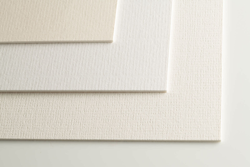
Archival-quality inks and paper will give you a result that lasts. Cheaper products can end up being a false economy when the ink starts to fade and you lose that treasured picture. There is a huge range of papers to choose from and they can all affect the final result in various ways. From heavily textured to silky smooth, matt to gloss, and more, it is worth getting hold of a sample pack of papers to get a feel for what is out there. To see the properties of each paper most clearly I would recommend getting the same image printed on several paper types if you can afford to. Samples often come with a separate image for each paper type, which doesn’t allow you to compare as easily.
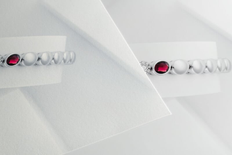
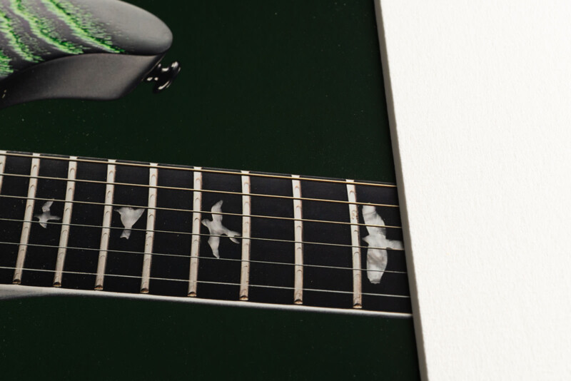
The image below is a phone shot of the same image printed on two types of paper. The one on the right is Lustre paper and the left one is on a Fine Art Rag textured paper. You can see the texture quite clearly and the colors are different as well. Moreover, the matt Fine Art paper has banding in the gradient background, which isn’t visible in the Lustre print – and before you ask, yes I had added noise to the gradient to make the banding invisible on screen. (The specks are dust – the image is straight out of camera).
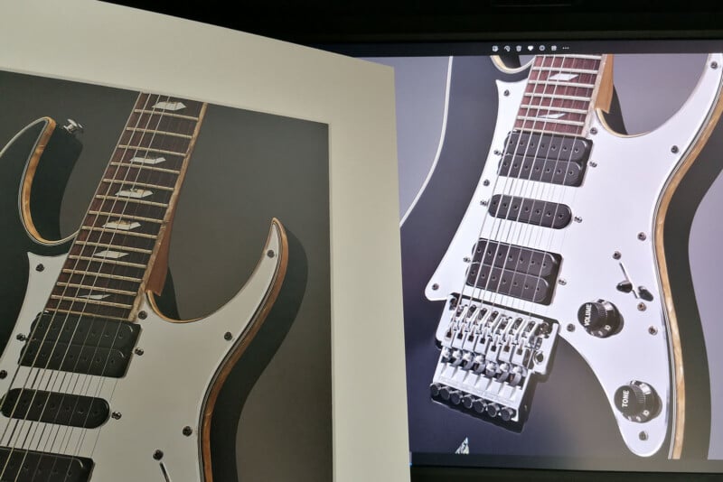
The next images show close-ups of the test prints for one of my award-winning images. I tried it on Lustre paper and on Photo Rag. The colors, texture, and appearance vary so I had to pick the one that was closest to my vision for the image. In the end, I went for the Photo Rag as I preferred the look and wasn’t keen on the slightly magenta look of the greys on the Lustre.
There isn’t really a completely right or wrong answer when it comes to paper choice. Sometimes there can be decisive factors such as the color rendition or visibility of artifacts that steer your decision. Otherwise, it is about finding a paper that you as an artist feel suits the image. Making a conscious choice for a reason is far better than choosing a paper because it is cheap/expensive. For my Fellowship panel, it turned out that Lustre paper suited the images really well. That was great as far as I was concerned as it turned out to be a nice cheap paper!
Choosing The Right Mount/Frame
So, you’ve made your choice of paper and have created a print that you’re happy with. Job done, right? Well, not quite. Deciding how to present your print is another big step that can change the overall look once again. Consider the environment it is going to be displayed in. Is it contemporary or full of antiques? Are you at a competition where the judges will assess it in a white booth? Does your client want it to go on their brick wall at home? Particularly when selling artwork, there needs to be a good balance in the final product’s framing between suiting the image itself and its surroundings.
Having a strong color frame or mount can affect how the colors in the image are perceived. Equally, it could help the print stand out from the wall or make it blend in and be less noticeable. Ideally, when choosing a frame go to a framing shop where they can put samples next to the print so you can see the effect. The same goes for mounts, although you can sometimes buy cheap sample corners to test at home.
Mounts are a good way to give a little distance between your print and the frame. They are also required for prints entered into competitions. The width of the mount used affects how we perceive the size of the image and its relationship with a frame (if there is one) or the surrounding area. For competitions, people tend to use a white or off-white mount. Some can look a little cooler whereas others can appear creamy or warm. Subtle off-white shades can affect how your eye sees the colors in the print, so make sure to test first before committing to a mount.
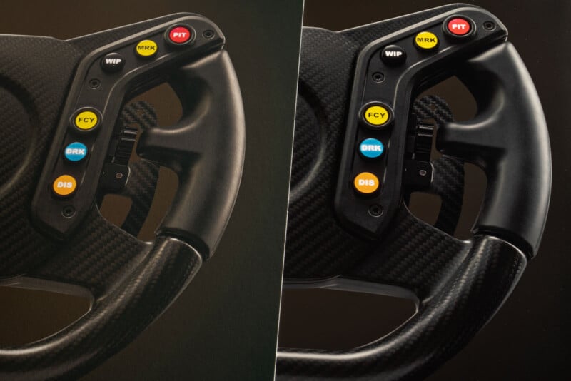
A dark mount such as the black one shown below can look quite smart. The downside can be that when placed alongside dark tones in a print it can then look more like grey or charcoal than black.
I find that a white mount can help enhance the contrast and make blacks in a print look darker.
Again, there isn’t really a “correct” choice as such. If you find it hard to make your selection, try asking others how they feel the mount affects how they see the image. With experience and feedback from those who are familiar with mounting and framing, you can discover what kind of presentation you want to show your images off at their best.
Soft Proofing
Soft proofing is a way of getting closer to seeing what your print will look like in advance. To use this function, you need to get the print profile from your printer or print laboratory. Install the print profile on your computer to use in your image editing software (this works well with Photoshop). You can then use the soft proofing preview option to see things more in line with how they will print. Remember that you are still looking at a screen that emits light, not a print that reflects light. So, the preview will not be identical to the print. Nevertheless, it is a very useful step in the workflow as it enables you to check things like the black-and-white points and the appearance of colors.
Read also: Soft Proofing Your Photos to Get the Most From Your Printer
Colorspace & Bit Depth
There are several colorspaces used for photography: Adobe RGB, ProPhoto RGB, sRGB, and CMYK. Each has its own range of tones available, some have more than others. When shooting and editing images it is best practice to keep as much data and color range as possible, so I would recommend using the ProPhoto RGB option or Adobe RGB if you don’t have that. When putting images online they need to be in the sRGB colorspace, but don’t convert to that until the end or you lose data and image quality.
Read also: The Photographer’s Introduction to Color, from Color Space to Monitor Calibration
Having a wider range of colors available is particularly important if you have gradual transitions of color (soft gradients) in your image. You are much more likely to get banding if you work in sRGB than Adobe RGB as there are fewer tones available for a smooth transition. Some print labs may accept files in Adobe RGB, but sRGB or CMYK is very common. Converting from an RGB colorspace to CMYK can affect the tones, so be careful if doing this. I have found that most labs I’ve worked with are happy with RGB images and I’ve only needed CMYK for mass printing such as leaflets or fliers.
Another term you are likely to encounter is “bit depth”. Keep this as high as you can throughout and only scale down at the end. For maximum quality, choose the highest bit depth settings available on your camera for RAW files. Then, edit in 16-bit and only scale down to 8-bit when the file output needs it (e.g. jpg files for online).
Read also: 8, 12, 14 vs 16-Bit Depth: What Do You Really Need?!
Clipping – Black Point & White Point
When working on a computer, we have RGB values from 0 to 255 with 0 being pure black and 255 pure white. Depending on how our monitors are set up and what they are capable of displaying, we might only really see a narrower range than that. Similarly, a printer and paper setup may show everything from 0 to 4 as black, with no visible difference between the tones.
You need to get a feel for the range of tones that can be produced in print using the combination you have chosen. One way of doing this is with a test print. But you can also get a rough idea in advance by using the printer profile in Photoshop to see a soft proof. Choose View – Proof Setup and then the profile you have installed. Then select View – Proof Colors to see how the image might look on your chosen paper. If you have lost shadow detail, then you might need to brighten the blacks up a small amount to reveal them again. This is because the file held tones covering a range that the print would not be able to differentiate. You might find that in practice, your print shows black at values of 4 or 5 rather than 0.
At the other end of the scale is the white point. It is well worth checking that you haven’t lost highlight detail when printing as it is possible that your paper shows white sooner than at a value of 255. Bring your black point up and your white point down until everything appears correct in your proof. This gives you a much better chance of your print matching your vision.
Calibrating
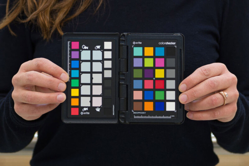
As well as the overall brightness of the image expressed in terms of the black point and white point, you also need to consider the reproduction of colors. You might not see the same tones when you print as you did on your screen. Calibrating each step of your workflow is the best way to give you consistent color data. You can then make artistic decisions about the final appearance. Shoot using a grey card (one known to be accurate at 18% grey) or better still with a color chart which software can then use to tweak the values. This enables your software to see how the lighting is affecting the appearance of the known colors from the chart and it can make adjustments accordingly.
Then, calibrate your monitor to ensure that it is displaying as close to accurate colors as possible according to the standard benchmark. The printer should in turn also be calibrated according to standard measurements so that it matches as closely as possible. You can then use your printer’s profile for the chosen paper as your soft proof view in Photoshop. Any adjustments you make to the file in preparation for print should be checked with the soft proof view to keep track of the likely results.
If you are thinking of getting a new monitor then make sure that it can display a wide range of color as accurately as possible.
Read also: The Best Monitors for Photography and Photo Editing in 2023
Refining for the Perfect Print
Even with a careful, methodical approach things don’t always turn out exactly as you might want them to. So, you may have to tweak your approach and try again. I would strongly recommend getting a few test prints done before submitting a whole batch of images and potentially wasting a lot of money. You might want to test print at a smaller size to save money if you are concerned about color, etc. but have no worries about the potential loss of detail at larger sizes.
View the print under controlled lighting if possible. If you proof your prints under one type of lighting but they are due to be displayed under a different type of lighting, then they won’t look quite the same. For competitions, your images should be judged under a daylight color temperature (normally some kind of light booth with daylight-simulating bulbs/LEDs). So, you should check your print under similar conditions – soft daylight – to ensure that you have the best chance of anticipating what the judges will see.
Then, rinse and repeat… It takes time to get a feel for producing prints. Indeed, perhaps it is best not to think of producing a “perfect” print as we could be chasing that forever. At least we’ve got some tools to help us along the way to creating better and even great prints.
About the author: Joe Lenton FSICIP MA ASWPP ASINWP ADPS is a qualified international photography judge and mentor with The Society of Photographers. He is a freelance advertising photographer specializing in product and architecture photography. Based in Norfolk, UK, Joe lives with his wife and two cats, Ozzy and Sharon.