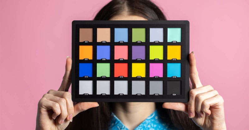
How to Use a Color Checker for Perfect Color in Photos
It will come as shock to no one that digital cameras are as complex as the manufacturing processes that make them. Thanks to the wizardry of Steven Sasson, our photographic pursuits are inextricably linked to the cold mass of integrated circuits, photovoltaic diodes, and the other discrete components that make up our modern tools.
I find myself often in the middle and my advocation for utilizing a camera calibration chart is primarily a workflow recommendation. I am a big proponent of any type of automated editing. If I can batch edit 50 images for white balance and color correction in a half a dozen clicks in Lightroom, that to me is the best way to manage time and increase aesthetic consistency.
I am not interested in re-defining your particular workflow or convincing you to purchase additional gear. Rather, my hope is that this presents a clear and concise primer on the purpose of color calibration with a reference target (AKA color checker) and the way that I utilize it in my own photography.
Table of Contents
What is Calibration?
The sole focus of calibration is to adjust captured or displayed color so that it aligns with a known, measurable value. So that we are all on the same page, let’s start with some foundational concepts. An 8-bit RGB system has 256 shades for each of the Red, Green, and Blue channels. Because 0 is an integer, it counts as one of the 256 shades. In a system where black is 0, this means that the color red is expressed as 255,0,0 in decimal code.
If you are already rummaging around your house or office looking for the Excedrin, I understand – hang in there just a bit more!
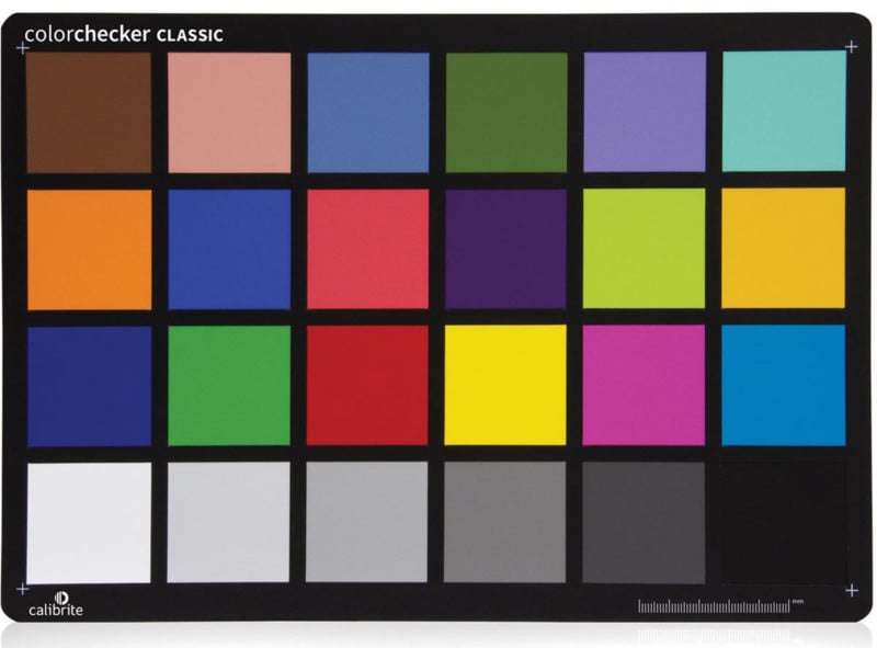
When we photograph a calibration target, we are capturing an image in which each of the 24 or more color swatches is precisely printed so that each swatch is a known RGB value. When a comparison is made between the known value and the captured value, any discrepancy between the two RGB numbers forms the basis for a profile’s adjustments.
For example, while not a typical calibration target number, let’s say we are trying to capture a known value of 255,0,0 (Red). Instead, we capture 255,100,0 – that is the numerical code for the color orange.
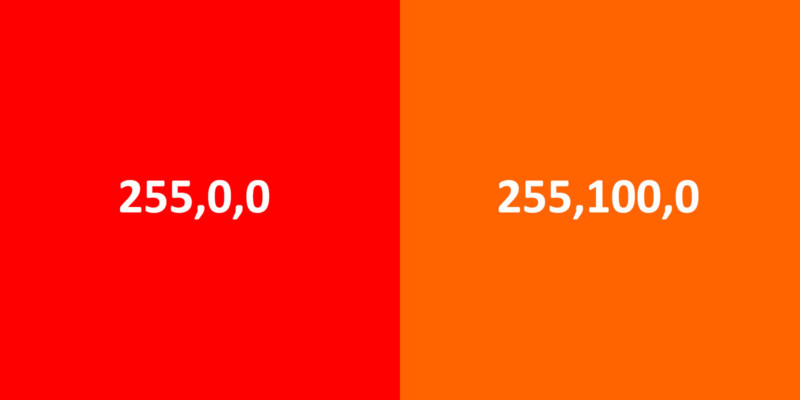
The camera has captured the image with too much green and to return it to the correct value, we must remove the green tint.
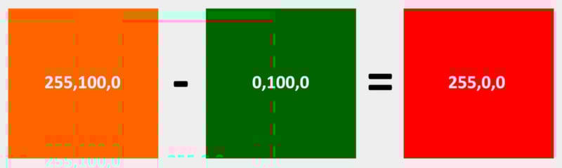
While a basic and somewhat extreme example, this is fundamentally how the calibration process and software work.
Below are two examples of uncalibrated (UC) versus the calibrated (C) images for both a Nikon Z6 (N) and a Sony a7 III (S). I chose these two cameras because I feel that they represent good middle-of-the-road options that many photographers utilize. As you can see, both cameras struggle to accurately capture the full spectrum of colors.
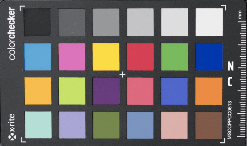
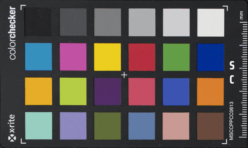
For this system to work, you must utilize a high-quality target because the individual target squares must be printed with a very high level of accuracy. I have used X-Rite (now Calibrite) targets for years now and have been very happy with them.
These are not the only targets that are worth your consideration, but these are the ones that I have been using since they were Gretag Macbeth. Find a target whose software integrates well with your workflow and produces solid results.
Color Accuracy Considerations
Not all color that is pleasing is accurate color. This is a particularly distressing thing for some photographers and it is important to say that the method of delivery does matter here. In the current market where often finished images are delivered and viewed on a screen, we must pay attention to the final stage of viewing.
That said, the reality is that the final stage of viewing is a total toss-up. Some viewers might use an iPhone, some might use Android. Some might use a MacBook Pro, some might be using a Walmart Black Friday laptop special. There is no real way to predict the hardware an image may be viewed on, and that places us in a difficult position.
I say that accurate color may be distressing to some photographers because I believe a lot of us (myself particularly) are control freaks when it comes to the final product. The unfortunate wakeup call is that sometimes we must be willing to abandon a certain amount of desire for control and instead side with a measurable, repeatable, baseline. I believe that creating correctly calibrated image addresses provides us with the best chance for our work to be viewed correctly given this range of viewing devices.
Additionally, as controversial of an opinion as this may be, I believe that most viewers of our work cannot truly distinguish the subtle differences that we obsess over as artists. In another life when I was a video editor, I had a client whose favorite phrase was “Let’s take off two frames there.” The reality was that he could no more see two frames of video than I could see angels.
In the instances that you are working with clients other than the average viewer, they will likely expect a higher level of color accuracy by default. Side with accuracy, don’t get caught up in worrying that your photograph might be slightly less saturated than you intended on some random phone.
Application of a Color Checker
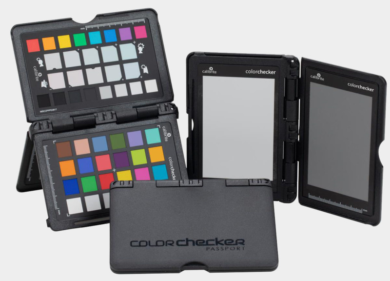
As I mentioned above, I really like the Color Checker Passport calibration targets for most applications. For those unfamiliar, it is a small, hard-shell, calibration target that has very easy-to-use software that can create both .ICC profiles and .DNG profiles.
The type of profile that you need will depend on the editing software that you are using. Adobe utilizes a .DNG profile because they felt the need to be special. Just about everything else (Capture One for example) uses an .ICC profile. As Adobe products continue to hold onto a large share of the market, I feel it appropriate to focus on the process for their software. There are a ton of great videos and tutorials on how to integrate calibration into your specific workflow, but this is the general approach.
Without getting too deep into the weeds here, there are a few variables that I feel are important to mention. As part of the curriculum in my role as an educator, students will experiment by comparing different cameras and lenses of the same make and model. While this does not apply to every camera and every lens, I have come to believe that the nature of mass production can provide varying levels of deviation in performance. Some of these variations have been surprisingly large and others are so small that it is hard to distinguish. Whatever the case might be, both the generic profiles like Adobe Color and even camera model-specific profiles have proven to be underwhelming for me.
Beyond the color calibration component, the color checker also provides dedicated squares for white balance. As I have mentioned before, I love automation and batch edits. Having a reliable white balance measurement for differing lighting scenarios is incredibly helpful for larger edits.
Steps to Capturing a Color Checker
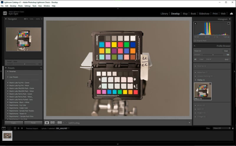
My color checker lives in my camera bag so that it is always available for me to use while out working. With the exception of street photography, almost every subject has an accompanying shot of a color checker shot. That does not mean that I will create new profiles for each image necessarily, but I have found that I never regret having the option should I need it later. Thankfully, the steps in camera are very straightforward and take very little time.
1. Both .DNG and .ICC profiles require shooting in RAW format, you cannot build an accurate profile from a JPEG.
2. Avoid touching the inside swatches with your hands to ensure oils from the skin do not discolor the chart.
3. Try to position the target close to the subject or in the same light as the subject.
4. Try to fill the frame as much as possible with the target.
5. Expose the target properly, a clipped highlight or shadow will prevent a new profile from being created.
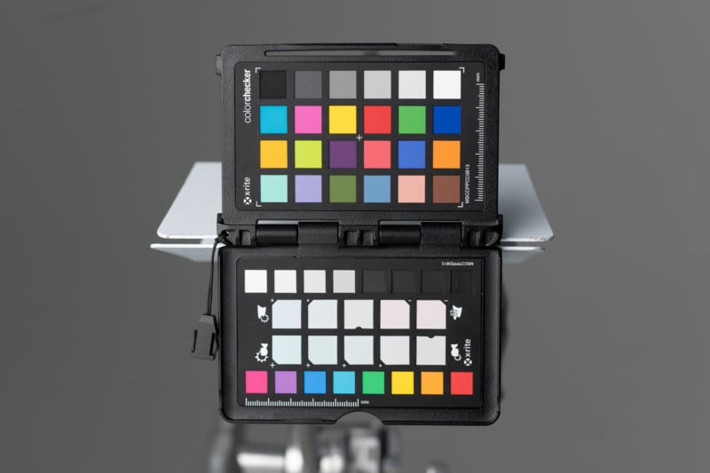
Your final captured image should look something like this. Don’t worry too much about getting it perfectly coplanar, or centered, or level, or even in perfect focus. Just get a properly exposed shot of the target in the subject’s light.
Creating and Using a Color Profile
Creating and utilizing a profile is equally straightforward:
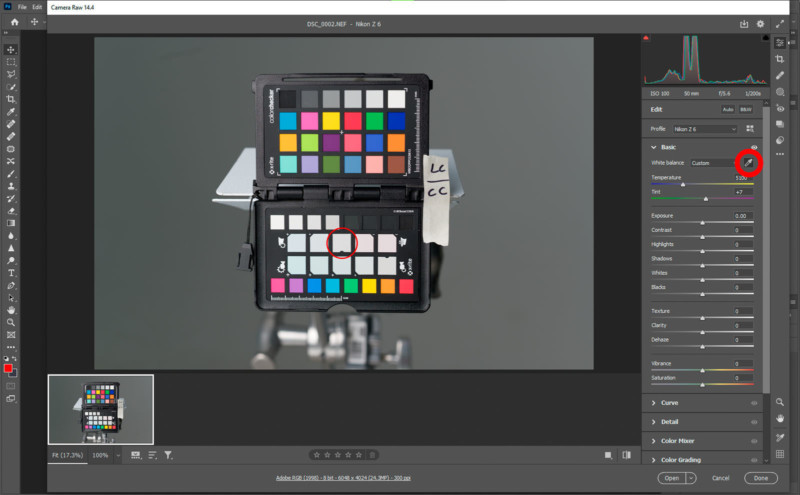
1. Open your raw image into Adobe Camera Raw and export a DXF.
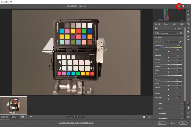
2. Save that .DXF in an easy-to-find location. I will typically save it in the same folder as the original RAW Image.
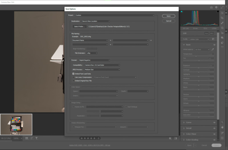
3. Drag and Drop the .DXF file into the Color Checker Software and adjust the green corner dots so that each square is centered with the corresponding color swatch.
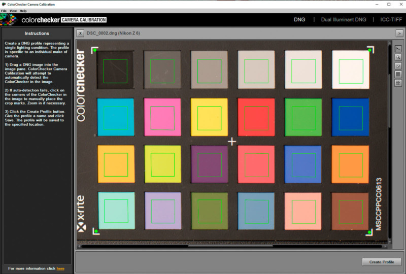
4. Save the profile with an easy-to-remember name in the default save location. Do not change the location!
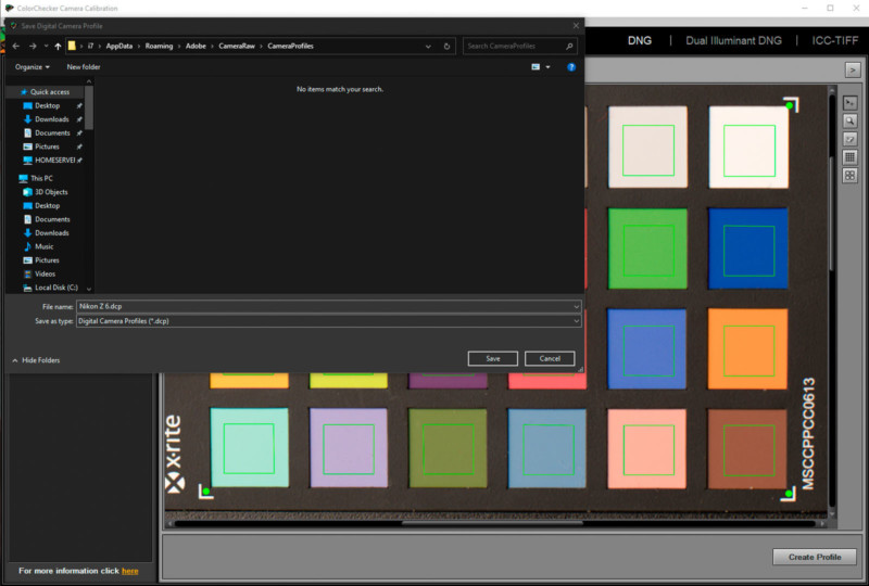
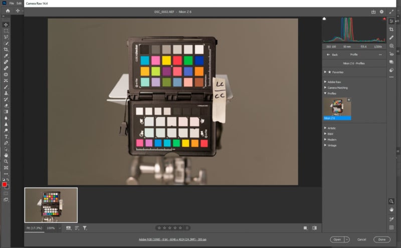
5. Once the software says it has successfully created a profile, navigate to the profile menu in either Lightroom or Photoshop. A software restart may be required.
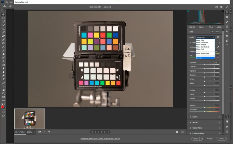
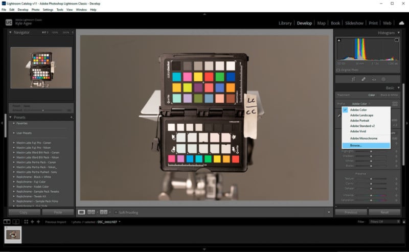
6. Browse and apply the profile.
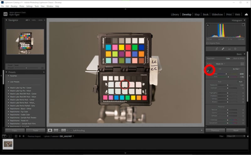
After your profile has been applied, there is one remaining adjustment to make. Provided that your profile is specific to the lighting environment you were shooting in, you can adjust the white balance with the Color Checker with the white balance selection tool in either Lightroom or Photoshop. Simply activate the tool and then click on the grey square with a small notch taken out of it and your Kelvin color temperature should now be updated.
As mentioned before, I love the option to do batch edits and this is a consistent time saver for me. Once the white balance has been set for the image of the color checker, you can then sync your settings across all images within that lighting environment. Even in the instances where I am not creating a specific profile, it is always nice to have a reference point for white balance.
One final step is the occasional purge of profiles that are no longer needed. Over time, it is easy to amass too many profiles to easily navigate through. Provided that the profiles do not serve some general, or consistent purpose, I like to remove them from the Profile folder, delete the ones I know I won’t need again, and save the ones that I might.
How Many Profiles is Enough?
How often do you need to make a profile? That depends entirely on the lighting situations that you are working in. Calibrite’s color checker software allows for the creation of a Dual Illuminant profile that I have found to work very well for a wide range of situations. It works by utilizing two images from different lighting environments.
For example, you might choose to create a general profile that covers 4000 Kelvin to 7000 Kelvin. In that case, an image from fluorescent lighting and an image from an overcast day would be combined to create a wider range profile than with a single image.
Each camera performs slightly differently, so it is important to experiment and see which lighting situations your particular camera excels at. You may not need to build a profile for high noon, but find that your camera suffers in the early morning or overcast days. Before you begin to build a generic profile, experiment with single environment images to find where the greatest changes occur.
Beyond a broader profile specific to your equipment, there are certain special lighting situations that almost always benefit from a profile being created. Provided that the lighting does not change in these environments, you can build a single profile and continue to use it.
A common example I use is mercury-vapor lights found in many school gymnasiums. Provided additional light from outside is not changing the lighting scenario, you can build a single profile and reuse it. This is also true for a studio with blocked or non-existent windows for example. Over time with use, the color temperature of the flash tubes may change slightly, but building a profile every two or three months has always worked great for me.
Conclusion
I don’t believe that color calibration is always necessary. As we saw above, there can be a great benefit to profiling your camera. I don’t want to have to edit if at all possible and often, the camera gets me close enough. However, just like my argument for shooting both RAW and JPEG, it is always nice to have it when you need it. Even if the only thing that I get from the color target image is an accurate white balance, it is worth the three seconds to capture the image.
Your particular equipment may not show significant improvement in your typical lighting environments. If that is the case, then this really isn’t a good use of time. Look at a recent shoot and compare the color captured versus the true color of the subject. Are the skin tones overly red? Do the greens look too blue? Whatever the case may be, if you aren’t completely happy with what your camera is producing, understand that it may not be an issue with you the photographer – it may be a hardware issue that can be easily addressed.
At the end of the day, I think most photographers would love to get out from behind the computer and this is a great way to help with just that.
Image credits: Header photo from 123RF