Histograms in Photography: A Guide
If you didn’t believe your grade school math teachers when they said you’d use graphs in the real world, you’re about to. In photography, histograms can seem intimidating, but they are incredibly useful tools that are much easier to understand than they appear. Learning about histograms will help you understand exposure, post-processing, and the overall structure of a photograph.
What is a Histogram?
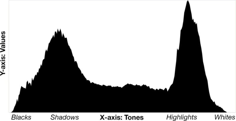
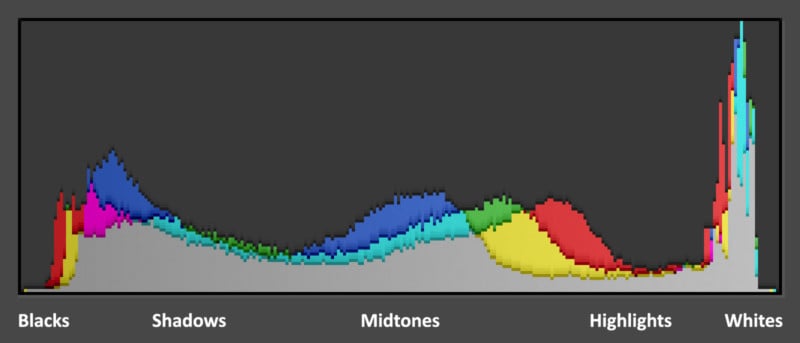
In photography, a histogram is a graph that is used to help gauge exposure. Each histogram is a graph of tones and their frequencies. The “X” (horizontal) axis represents tones, going from black on the left side to white on the right side. The center of the axis represents the midtones of an image, with the shadows to the left of the midtones and highlights to the right.
Tip: If you have trouble remembering which values are on which side of the histogram, just remember that “light” rhymes with “right,” and this should help you recall that the light values (highlights and whites) are on the right side of the graph.
The “Y” (vertical) axis represents the frequency of each respective tone. A high frequency of a certain tone is represented by a high value (a peak in the graph), while a low frequency is represented by a low value (a valley, or no value).
In very simple terms, a histogram is a graph showing how many pixels of each brightness value is found in a photo.
The bright parts of the image are displayed on the right side, darks are on the left, and midtones are in the middle. Each tone’s frequency is plotted, which will help you determine if an image has too many bright or dark values.
You may want to think of a histogram as if it’s a meter that tells you exactly how bright your image is using values, which is more helpful than trying to judge an image’s brightness using your camera’s LCD screen.
Using the Histogram on Your Camera
While your camera’s LCD screen can be useful for quickly reviewing images, LCD screens vary in brightness and can be hard to read in a bright environment. Histograms take the guesswork out of your exposures and will help you determine if your image is overexposed, underexposed, lacking contrast, and more.
Many cameras do not display their histogram automatically. If your camera has live view, the real-time histogram can usually be displayed with a few presses of the “Info” button (or equivalent).
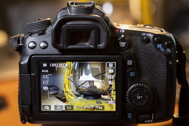
The histogram for an image you just created can usually be accessed by displaying the image and pressing the “Info” button (or equivalent) a few times.
If you still can’t figure out how to display the histogram, consult your camera’s manual.
Histograms for Bright Scenes
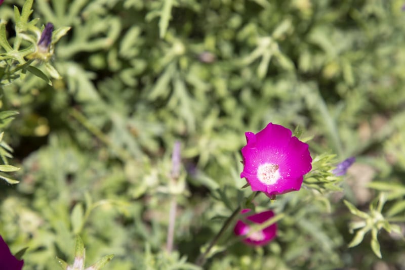
In bright environments, the histogram is useful for balancing exposure on both ends. It is easy to overexpose a bright scene, especially if there is a high dynamic range (a big difference between the brights and darks). Remember, lights are displayed on the right side of the histogram. In a bright scene, you’ll likely see high values on the right side.
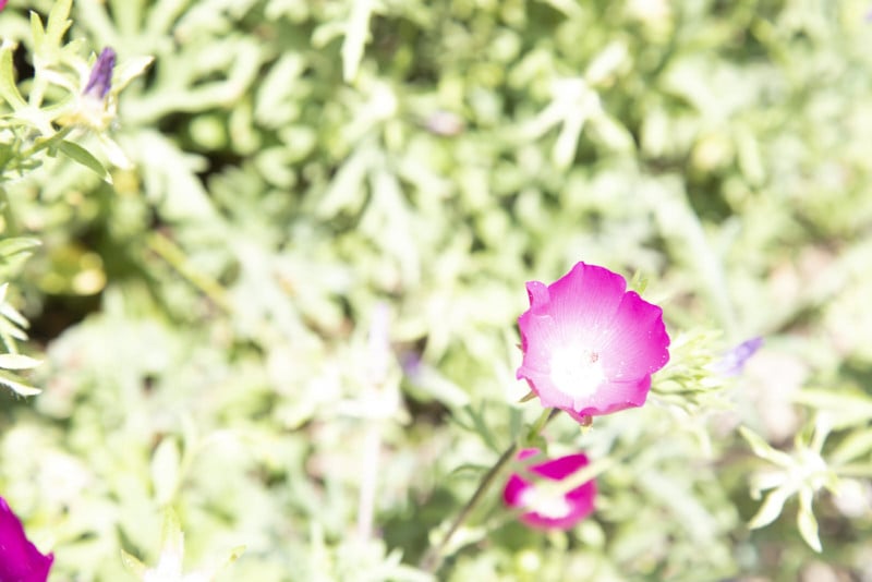
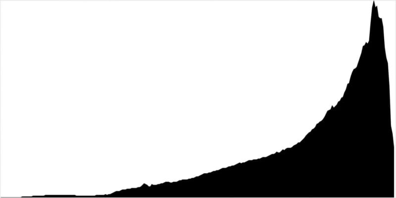
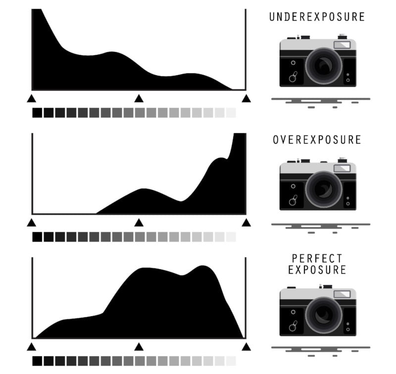
If the histogram displays values running off of the right side (i.e. a large number of pure white pixels at the maximum x-value) this means that the image is overexposed. In this case, the highlights are “washed out,” meaning that no detail is captured (and cannot be recovered well) in the brightest parts of the image. Another word for this phenomenon is “clipping.”
To fix this, unless it’s your artistic decision, simply darken your exposure by changing shutter speed, aperture, or ISO until the highlights do not run off the right side of the histogram any longer.
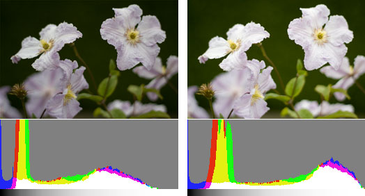
In the example photo above, the overexposed image clearly has values running off of the right side of the histogram, indicating clipping of the highlights. The more standard exposure does not have highlight clipping, but it is important to note that there is a minuscule amount of shadow clipping (hence the left side run-off). This can likely be disregarded in this case, because it is such a small amount.
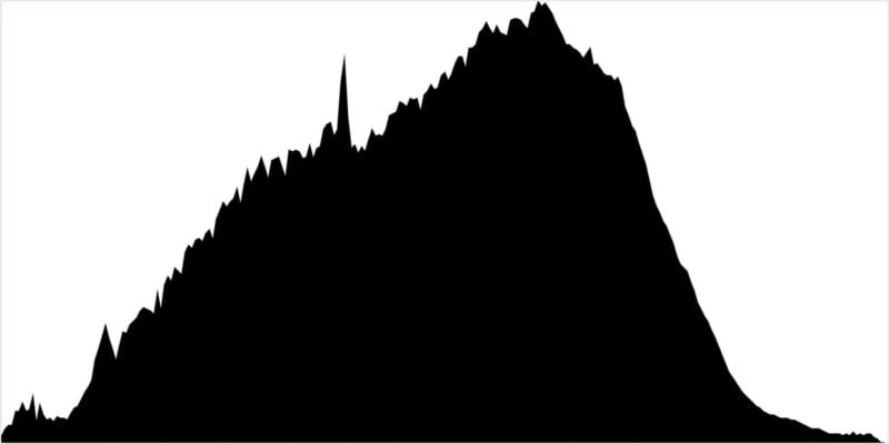
Sometimes, especially in high dynamic range situations, highlights are clipped even when the image doesn’t appear overly bright. Try to consult your histogram quickly in high dynamic range situations to be sure that you are capturing as much detail as possible in all areas of the image.
Histograms for Dark Scenes
In a similar way that histograms are useful in bright scenes, they will help you determine if a dark scene is lacking detail in the shadows. Dark environments are easy to underexpose, although it is often an artistic decision to expose an image slightly darker than normal for effect. Darks are displayed on the left side of the histogram, so dark scenes will likely have high values toward the left of the graph.
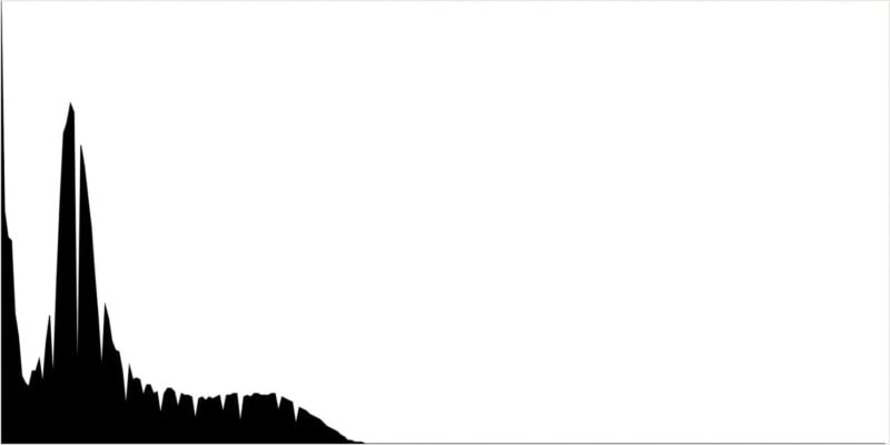
In an opposite way to bright scenes, dark scenes will have values running off the left side in the case that the image is underexposed. In this case, the dark parts of the image are being clipped, and there is no detail being captured — this is sometimes referred to as “crushed shadows.” If this isn’t your goal, you can brighten your exposure by changing shutter speed, aperture, or ISO until there is no run-off on the left side of the histogram. Be sure not to go too far, because you probably don’t want to lose detail in the highlights either.
In the example image above, the underexposed example has a clear run-off on the left side of the histogram. In fact, there are no values to the right of the shadows. The more standard example looks much better, with detail in the midtones and highlights as well.

There is still slight clipping in the shadows, but it’s so minuscule that it can likely be disregarded and won’t affect the overall quality of the image too much.
Using the Histogram in a Post-Processing Tool
If you use Adobe Lightroom or similar software, you’ll probably notice a histogram in the main editing module. In Lightroom, it is usually located in the upper right corner of the “Develop” module. Just like the histogram in your camera, this graph will help you gauge your image’s exposure. A computer has the same issue as your camera’s LCD screen, which is often disregarded. Computer screens can vary greatly in brightness, and using an editing tool’s histogram will help take the guesswork out of adjusting exposure.
In Lightroom, the histogram can be manipulated, thus adjusting the image using the histogram itself. Even if you don’t use this in your post-processing workflow, dragging the histogram one way or another will help you understand what each area of the histogram corresponds to.
Lightroom’s histogram is a great tool to use on a test image while learning how to read a histogram.
One other important note is that Lightroom’s histogram has a feature that will indicate clipping of the shadows and highlights on the image itself using colors. In the upper right and left corners of the histogram, you can turn on highlight and shadow clipping to display blue over clipped shadows and red over clipped highlights. This is a quick indicator that something may need to be adjusted, and will help remind you to check the histogram.
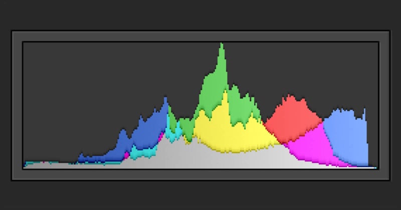
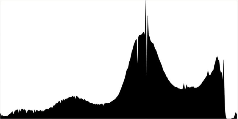
Color Histogram
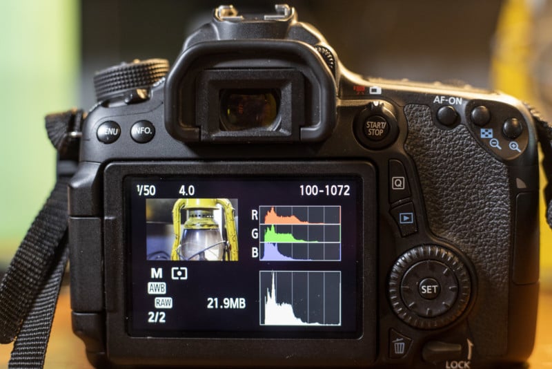
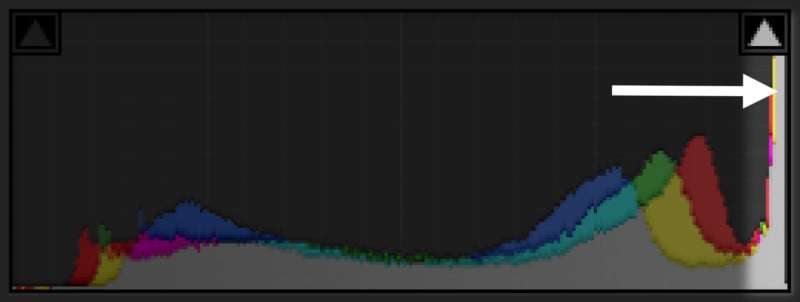
Many cameras and post-processing software will also display a color histogram. This will most often be separated into reds, greens, and blues, with graphs for each respective color.
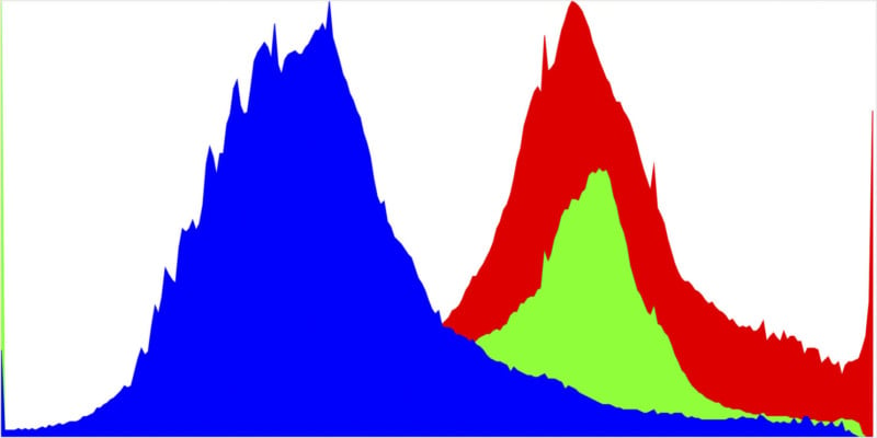
Similar to the general exposure histogram, the color histogram will help you determine if a certain color is too bright and therefore lacking detail. When colors become too saturated, they lack detail similar to how shadows and highlights lose detail when they become too dark or bright. This is especially useful in scenarios where one color is very present and might take away from the detail of the entire image if its levels aren’t set properly.
In the example image, the red, green, and blue histograms are displayed on the same graph. Notice how the red histogram runs off of the right side, indicating that the reds are intense and lacking detail. There is also clipping on the left side of this histogram in the blues and greens.
Exposing to the Right
An interesting and controversial histogram-related technique is called exposing to the right, or ETTR. Essentially, this means pushing the histogram as far right as it will go without clipping the highlights, hence pushing the values to the right side of the histogram.
The theory behind this is that more detail and dynamic range are recorded by capturing the maximum amount of light possible without overloading the pixel sites, and the exposure can easily be corrected and balanced using post-processing software. This also has a supposed effect on reducing noise, by improving the signal-to-noise ratio.
However, just like similar exposure theories, this technique has been challenged as sensor technology improves. Whether it’s useful or not, it’s an important histogram-related term to know in photography.
Histograms Are a Guideline and a Tool
Histograms are useful in most types of photography. However, it’s easy to get into the habit of striving for a “perfect” histogram in all of your images. Some of the best images have clipping of shadows or highlights, too little contrast, and many other “histogram issues.” Ultimately, exposure is an artistic choice, and there are no rules dictating how bright or dark your image should be.
As an exercise, try to make a series of images that are all clipped in shadows and/or highlights. Experiment with characteristics that make those images look good. This will help you understand your histogram and recognize that many different exposures lead to great results. Think of the histogram as a tool that is available for you to use, not a rule-making constraint.
Conclusion
Take the guesswork out of your photography as much as possible, and you’ll find that your images will be more consistently impressive. The histogram is a wonderful tool to judge an image’s actual exposure, as opposed to trying to determine how bright or dark an image is from an LCD screen in varying lighting conditions.
It may look intimidating, but a histogram is just a plot of how intense different parts of your image are. With just a few minutes of practice, you can learn how to start using your camera’s histogram to improve your photography.
Image credits: Histogram high/low and under/overexposure illustrations from Depositphotos.